Ever wondered what the drawbacks of appearing too high end are? Let me tell you, you leave a huge market untapped because the middle-class, the domestic consumer feels too intimated by your high-end brand persona.
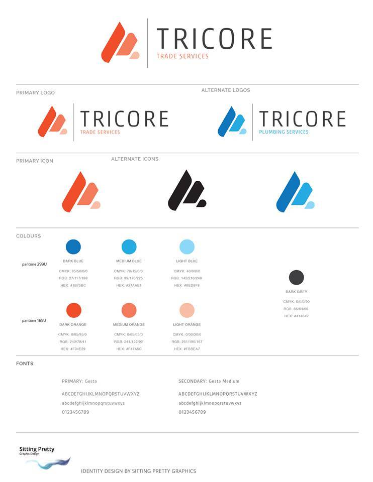
Offering a multitude of services ranging from domestic/residential plumbing to mining and industrial hydraulic services - Tricore Trade Services needed to re-brand and make it more flexible for it's ever growing sub-brands like Tricore Plumbing.
THE ISSUE AND THE SOLUTION
The brand itself wanted to expand its presence in the domestic market but the major issue they were facing was their commercial-big-company persona intimated potential customers to the point where they didn't even consider asking for a quote.
Thus started the journey to make Tricore Plumbing more appealing to the domestic user. We took the blue from the original logo and reserved it for the Sub company (Tricore plumbing) and kept the orange for Tricore Trade Services!
Why orange?
We chose orange for how apt it was for the commercial construction market they are a part of. Moreover, the dynamic vibe that orange gives to the logo is invaluable!
It was extremely satisfying to see the entire idea unfold and how our clients took it. Orange is generally associated with the construction industry, simply because of the colour of construction machinery.
We used this to our advantage, and it was just satisfying how the colours just fell into place with the market the sub-companies were trying to capture.
All in a days work!

