Company Name: Orange Environmental
About the Company
Orange Environmental is a small boutique environmental consulting business. For the last ten years, Natasha (Principal Scientist and Director, Orange Environmental) has worked as a sole trader and specialises in managing the environmental approvals process for major infrastructure projects.
Her business is a bespoke one in that differentiates itself from other environmental consultants by delivering a tailored solution for each project they take on.
Project Brief
Natasha wanted a refined and more in-depth interpretation of the idea she based her first logo on. The idea she wanted us to focus and work with was
“The idea behind the logo was the horizon of the earth, conveying the orange colours of the earth at sunset/sunrise and/or the Australian outback. I was keen to have an ‘environmental’ angle, without using the green/eco angle that so many environmentally based companies use. I’d like to keep the colour theme of orange, grey and white (and possibly purple as an extra accent colour which I use sometimes in reports where I need another heading colour), and also keep some incorporation of the shape of the earth or the horizon within the logo…”
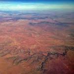
She also attached some pictures for reference
The Result
Provided with an extremely comprehensive brief, it was a treat working with a client who had such a clear idea of what they wanted in terms of colour palette and basic concept.
We worked around the original idea of “Horizon of the earth” and incorporated the colour palette of the clients choice.
The logo itself is detailed enough to visually explain what Orange Environmental does, but at the same time clear enough to convey the very values this company is based on.


