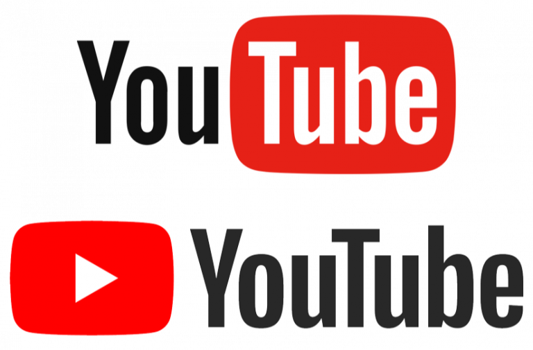
After almost a decade, YouTube has redesigned its logo. In a daring and bold move, these industry leaders have tweaked their logo to match their modernized user interface.
WHAT DOES THE NEW LOGO LOOK LIKE?
The new logo has the music and video streaming giants name and Play icon split up. The best thing about this split up is the fact that the Play icon immediately makes one think ‘YouTube’ – in this sense, this logo that has become the unofficial brand ambassador has been put at the company’s visual forefront.
GOOD THINGS ABOUT THE NEW YOUTUBE LOGO:
1) No need for the YouTube word mark to accompany the logo all the time. The play is already something users relate to YouTube, this redesign reinforced and deepens the roots of this association.
2) Design works well across a variety of devices: After the redesign, the logo looks slicker and cleaner – making it more flexible and accommodates a different screen and device sizes.
3) Matches newer interface: The newer version is faster in terms of speed and the newer features include suggested videos and playback speed options. The simpler navigation has been reflected in this modern redesign.
4) Easier on the eyes: The previous design and colour was a more intense and black and red theme, the white and red is easier and less strenuous on the eyes.
The play button has been made the star of the new YouTube logo. A lesson that can be learnt from this logo redesign is to focus on the core and most popular feature of your brand and put on the forefront.

