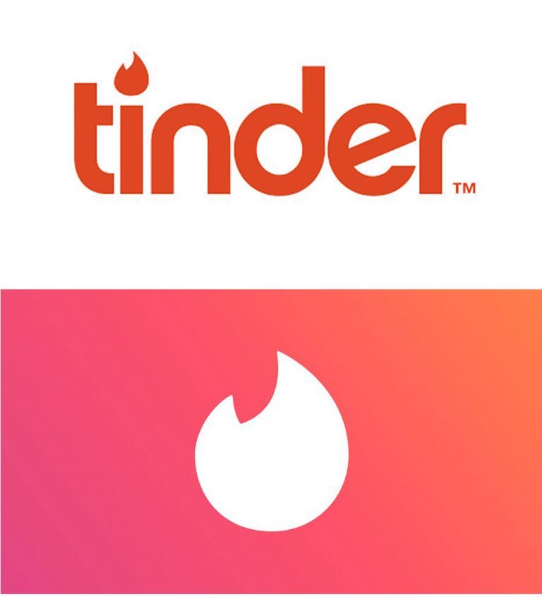
As one of the most used dating applications – Tinder – reached the first half of 2017; the company decided to redesign its logo.
From the word mark to a single flame-only representation of the application. In the opinion of many, this was a rather bold move coming from a company that was fairly new and extremely widely recognized via its wordmark logo.
However, there is more to this simpler representation than just a redesign, but rather a way to introduce a more simplified version of the dating app.
The updated version, like the logo, has a cleaner display of images and easier navigation of profiles.
In conclusion, it is essential that an icon is designed keeping the level of visibility in mind. The icon of your application will be visible on people’s phone screens and widgets, therefore, making it one that is not only attractive and appealing but one that is simple and sends a clear message.

