
How often do you and I come across a logo that is simple words over a picture? When an entrepreneur is looking for a starting point for their business’ identity, they immediately think – logo.
Essentially, the primary purpose of a logo is to create an identifiable identity for a brand! A well thought out use of shapes, colours and other elements to draw a connection between the customer and the brand.
More recently, it seems that there is an abundance of ‘graphic designers’, hence, the blurred definitions of what actually classifies as a logo.
1) AUTHENTIC
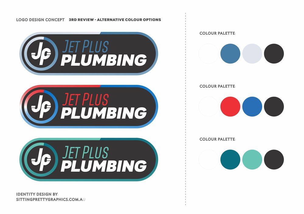
The whole idea is to create a unique identity for a brand; therefore, a colour palette that is unique should be your starting point. For instance, if you are trying to design a logo for a drinks brand, the colour combinations of blue and red should be a good place NOT to start.
Originality is the key when designing a visual identity for a brand. You want to stand out.
2) SCALABLE

As brands and companies grow, they venture into new markets and introduce new products. Therefore, it is an extremely unwise investment to invest in a logo or a logo designer who does not understand the value of a versatile logo.
The general rule of thumb is to approve something that looks as good on a billboard as it does on something as small as a pen. It also needs to look good in all white or all black.
A logo should be flexible enough to grow as the brand and their product range grows.
3) RELEVANT AND IMPACTFUL
Though relevant is relative, there is a vast difference between creativity and irrelevance.
There is no harm is being creative when it comes to designing a logo, but there at the same time caution should be taken to ensure that the logo you have designed is actually relevant to the brand, their image and their product line/service. Your logo needs to appeal to your target market.
4) ABILITY TO STAND THE TEST OF TIME

This one I absolutely swear by! A logo should not be so trend focused that it loses its ability to stand the test of time.
As a business owner and a brand owner, the goal is to become the next big thing and expand. It is, therefore, essential that the logo one designs is simple enough to be an identity that will still be relevant as time passes.
You really don’t want the hassle of a re-brand every time the trend changes!