LOGO EVOLUTION
COCA-COLA VS. PEPSI
PEPSI LOGO DISSECTED
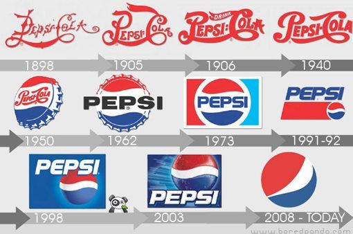
Pepsi soon got rid of its first logo that looked like it had been scribbled by a child version of Tim Burton.
Over time, the logo has refined into what it is now; a circular, red, blue, and white. However, what Pepsi has failed to do is keep consistency. They started out with a logo (1989) that was only red and remained red till the 1940s.
The 1940 version of the logo started to look a lot like the refined Coca-cola logo. It is then that Pepsi decided to change its colour theme and introduce blue and white that has become synonymous with the soft drink brand!
Good things about the evolved Pepsi logo
- Vastly different from the Coca-Cola logo, has its own following and identity.
- The blue, white and red were used as proof of patriotism and love for all things country
- In line with Pepsi's hip and young brand personality.
All in all, there is massive room for improvement. Pepsi has spent billions of dollars on its re-branding and logo redesigning but they have failed to create the desired impact. They have failed to retain and use their brand history and heritage to their benefit.
