BRAND WARS
COCA-COLA VS PEPSI
It is no secret that Coca-cola has, perhaps, one of the most recognised logos around the world. The red and white theme has become synonymous with the brand's identity and image.
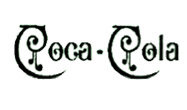
However, the logo, as we see it today, has not always been this refined. In the 1890s, the brand had this extremely strange logo with extra swirls, however, this only lasted for a year.
As the brand grew, so did their focus on brand identity and image. In the 1947s, we see the colour red being introduced into the logo. For years after the red was retained but the script wasn't seen on its own (as it is today) but rather within a fish-shaped box (1958-1960s) or the classic square (1969), 2003, and 2007)
WHAT MAKES THE COCA-COLA LOGO EFFECTIVE?
Unlike the Pepsi brand, Coca-Cola did not change it's colour theme and identity completely over time. Their focus and ultimate goal has always been to touch the hearts of their consumers in a way that ensures brand loyalty.
Even as we see the logo evolve over tens of years, we see the same font and red colour that ensures familiarity. It is this familiarity that has made the logo what it is today - a benchmark for one of the most effective logos in the industry.

