
LOGO THOUGHT PROCESS
ABOUT THE COMPANY
The company itself is multi-faceted, offering a number of services. A complete service package, Instyle offers painting services, carpentry and plastering. Quality focused, the company prides itself on their professionalism and long-standing reputation.
CLIENT REQUESTS
One of the first things we ask our clients is to fill out a form and give us an idea of what they imagine their logo to look like.
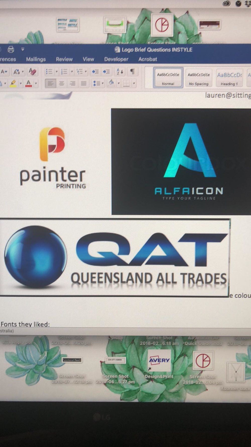
The folks at Instyle wanted a gradient but a logo that is an encompassing and representative of the complete services they provide; painting jobs to carpentry.
THE FINAL OUTCOME
We wanted to go for a logo that can stand the test of time; saving the owners of the company the hassle of a re-design every time a trend changes.
THE COLOUR CHOICE
After a lot of playing around, we decided on a shade of grey-blue, that has a calm, composed and stable vibe. This idea of stability stems from the company's focus on high-quality deliverance.
On client request for a gradient, we went for a softer gradient/fade that gives a more professional, and confident vibe.
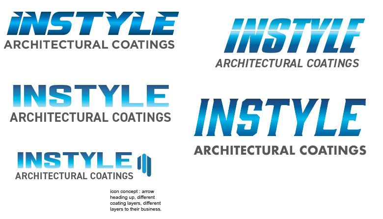
THE LOGO ITSELF
![]()
Composed of an upward moving icon, the logo is a representation of the companies potential for growth and multi-faceted service.
A symbol of progress, the icon represents a sense of control when managing projects.
CLIENT REVIEW
“Quickest sign off, we have had this month!” Says our Creative Director Lauren.
The client absolutely loved the vibe that the entire logo was giving off. Happy with a more professional, and softer gradient, our choice of colour, and concept was BANG ON!