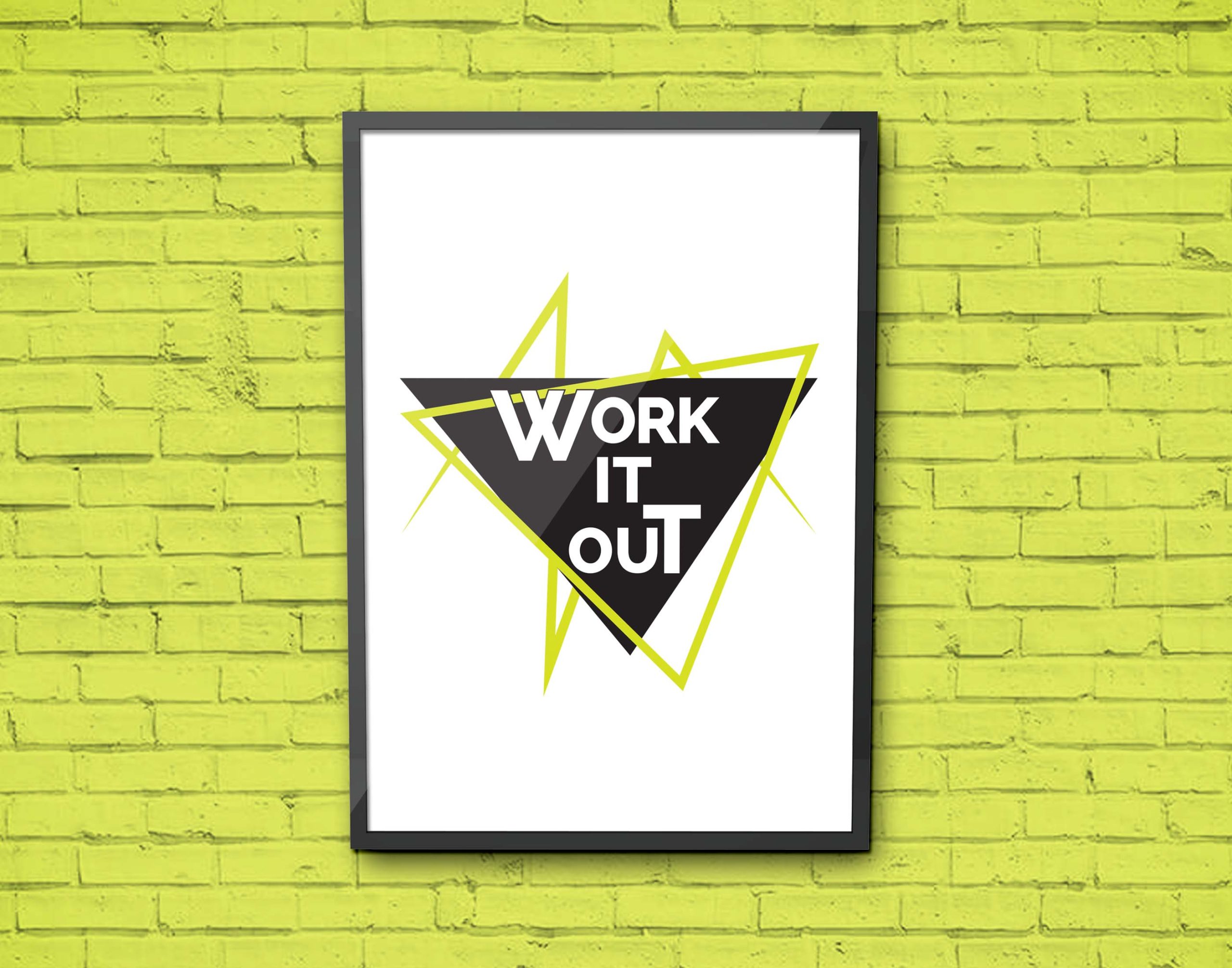
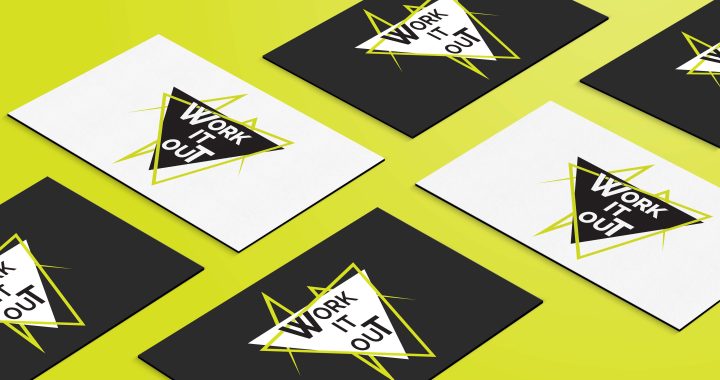
Work It Out Fitness Logo

The Brief
Work It Out Fitness needed a new look. They wanted to show people what to expect from each session, a vibrant and positive energy. The client really loved a 90's aesthetic and all the fun that goes with that.

The Approach
Imperfect geometric shapes and a bright but simple colour palette helped to really emphasise the energy, fun and freedom found in moving your body with Work It Out.

The Result
A bright, fun, energetic, 90's - esque logo that the client was super happy with.
