RJP Design and Decor

The Brief
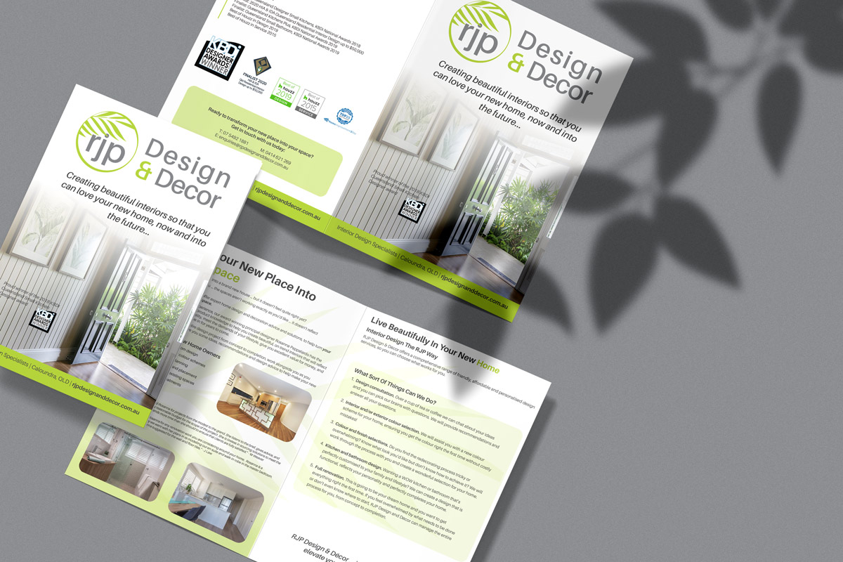
RJP Design and Decor did not actually have a logo, they had some text that sat on top of a photo of a palm leaf they used, at least consistently, across their branding. We created a logo for them using the palm leaf theme their customers had come to recognise, but which was now more widely useable in marketing materials going forward. We also needed to create some A4 bifold brochures to be given to different customer audiences, so the content and design had to be adjusted for each audience, but still be brand consistent.

The Approach
We were requested to use the palm leaf theme in the logo as it had become a large part of the brands identity over the years. The colours and fonts we chose to bring a fresh and professional feel to the brand. We created short, square and long layouts of the logo so that the client always had a version of their logo that was suitable for any project in the future. We used audience appropriate imagery for the covers of each brochure and adjusted the content language to suit the audiences desired knowledge.

The Results
RJP Design and Decor now have a fresh logo that represents their brand and what they hope to bring to each project, freshness, professionalism and holistic approach. They have brochures that are professionally designed to give to their potential customers that are designed to appeal and communicate effectively to each of the different audiences in their customer pool.
