

We focused on their target demographic i.e Construction industry – Builders, Residential, commercial companies, renovations, local residents etc.
They wanted a logo that instilled confidence in their potential and existing customers about the work handed over to TNT Qld. Additionally, they also wanted their Unique selling traits highlighted i.e perfection, honesty, workmanship, and reliability.
The clients preferred light greys, black, sky blue, white, and neutral colours - pre-deciding our colour palette.
TNT was also looking for some social media templates for the launch of their social media handles.
Based on the brief we started working on 3 core logo concepts
-
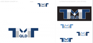
- TMT is made out of tiles,the colour palette being in line with what the client preferred. The font used is strong and masculine. Addiotionally, the intersecting shapes of tiles making up the letters imply a creativity and mastery of tiling that TMT wants to be known for.

-
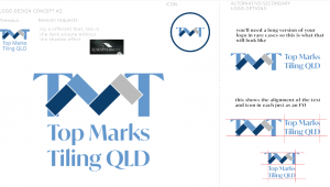
- Concept was the M in TMT coming from the herringbone tile pattern. The colours and font are similar to concept one , strong and masculine with great readability. The herringbone tile shapes could also be expanded into a pattern used in future branding projects. However, the client wanted a revision and wanted to try a different font, like in the dark picture without the shadow effect.

-
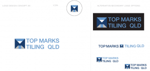
- Concept is T M T made in an abstract way out of different coloured tiles in a square. Font and colours as per previous concepts, but fonts not as thick this time

