Platinum Joinery Interiors

The Brief
Platinum Joinery Interiors are a shop/office fit out company, specialising in high end joinery. They also do kitchens and joinery packages.
PJI had a terrible logo from when they first started out and were now wanting something that better represented their company.
PJI wanted clients to perceive style, premium quality, uniqueness and trust in their brand.
The target demographic is business owners / architects / retail chains and designers.
The thing that separates them from their many competitors is attention to detail and their ability to oversee / run the projects to ensure a smooth process.

Our Approach
Researching the competition is always the first step, determining a colour palette / moodboard of style.
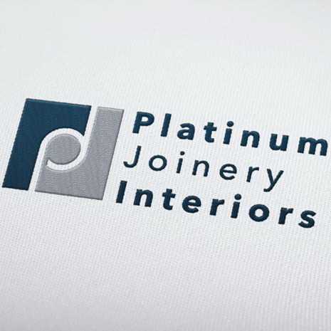
PJI prefer a minimalistic icon + text style of logo.
We explored many different fonts until we found one that felt smooth with a bit of elegance / class to it.
The client wanted to keep just the colour blue from their previous branding, so we tied that in with a classic grey/blue and a silver option in the colour palette to emphasise the ‘premium quality and seamless process’ vibe we were aiming for.

The Result
The concept was Seamless / smooth. Smooth processes, smooth surfaces, smooth joins, seamless experiences all of which require attention to detail.
Sneaking in the letters of the company name in a geometrically measured icon was a cool touch which brought together the whole concept to represent the things PJI pride themselves on, attention to detail and smooth processes/ experiences resulting in a premium quality finish.
