iProperty Management Services Branding

The Brief
iProperty Management Services will be a Property management business, competing in the residential market.
They will operate from a home office and their main point of difference is that they are family owned and operated.
They will take a proactive approach to property management, as a boutique firm and catering to a specific segment of the market who are looking for more personalised approach to property management.

Our Approach
The client had some initial sketches of what they were thinking for their logo which they brought to us which really helped guide the style of logo we created for them.
We wanted to create something that was representative of their specialist and modernised approach to property marketing.
The business name lent itself towards a personalised / personal concept so we explored the monogram idea pretty thoroughly. Colours were used as a way to create a point of different in a market full of primarily black colour schemed real estate agencies.

The Result
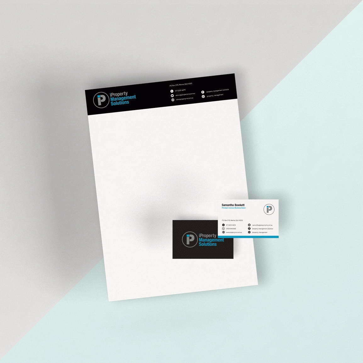
A monogram inspired minimalistic stamp to communicate personal service and family values, with a colour palette to reinforce the idea of being different to the rest of the property management services market.
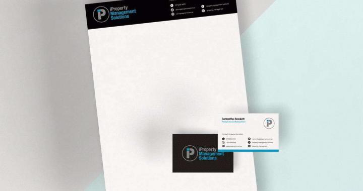
We also created business cards, letterheads, with comps slips and email signatures as part of this modern, personalised brand.
