Lionhart Painters

The Brief
Liohart wanted to appeal to the mid-market, not too expensive but also not budget.
The Brand needed to be masculine rather than feminine, contemporary but timeless – the logo should not date.
A prominent icon or mark was requested, along with bold contrasting colours, preferably blue or burgundy. Due to the name, something to do with a strong lion was also requested.

Our Approach
The concept was developed by researching more into the values of the company, to find out something that set them apart in a saturated market.
We found that the company had a great work ethic, were proud of their work, supported Aston Villa football club and to them, family was the number one priority.
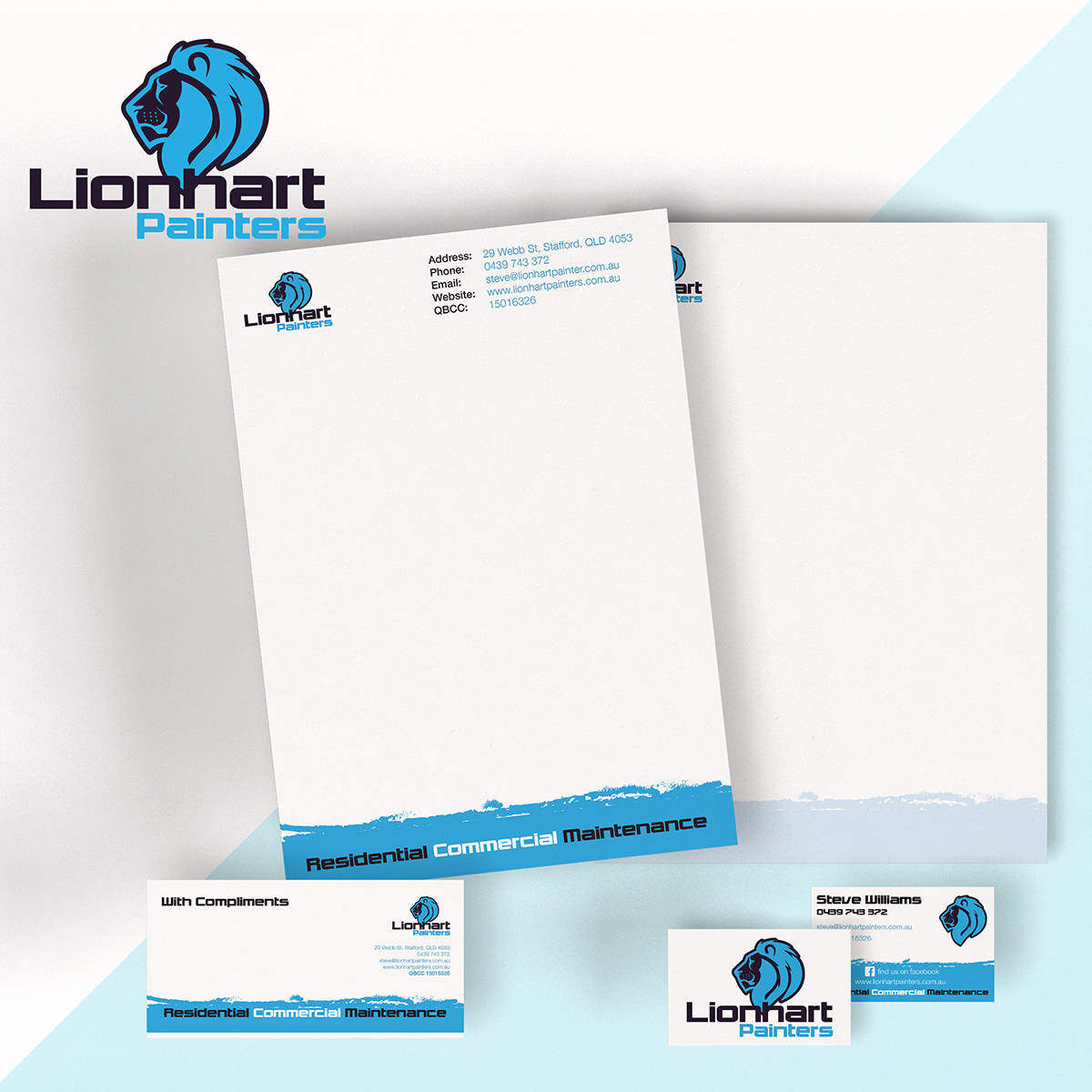
Based on this our concept was the word Pride, so we created a prominent, hereditary, strong looking lions profile in a mass appeal blue colour that contrasts strongly on white and black, without being too complicated, with a solid and clean font.
Thus the Lionhart brand was created – the pride of the painting jungle.

The Result
The result was a logo that is instantly recognisable at small and large sizes, with the same font, paint textures and graphics carried through the rest of the brand to maintain consistency.
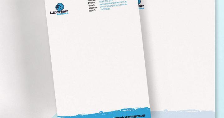
We created business cards, letterheads and with comps slips as part of Lionhart Painters branding package.
