Although there is always something sleek and classic about a black and white scheme, new colour trends are important to stay innovative and fresh when it comes to your brand – so here are the best trends for this year.
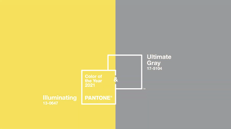
2021 is all about bouncing back better than ever, which is why Pantone’s colour of the year is actually two colours: Pantone 17-5104 Ultimate Gray and Pantone 13-0647 Illuminating, described as a “message of strength and hopefulness” that is enduring and uplifting.
Ultimate Gray is the resilience and strength to Illuminating’s yellow tone, which represents the cheer and hope for better times whilst invoking feelings of composure. These two colours are a wonderful compliment to each other so keep an eye out for them in your daily life and in branding.

(Source: Pantone Color Of The Year 2021 INTRODUCTION)
Other key trends for 2021 include:
Analogous colour palettes:
Analogous palettes will be prevalent due to the sense of aesthetic cohesion and harmony that comes with colours close to each other on the colour wheel. Colours such yellow, yellow-green, and green or red, orange, and yellow work well as a gradient without the colours blending together.
You will often see these in brands that utilise multiple colours to evoke different feelings that represent their companies (red and yellow for food and hunger, yellow and green for nature and environment, and blue and purple for a cool and calm emotion).

Muted colours:
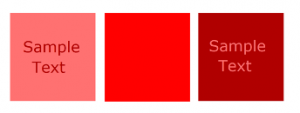
This doesn’t just mean soft pastels – muted colours are essentially desaturated hues mixed with white or black that aren’t the most immediate pop of colour (think salmon instead of bright pink or maroon instead of vivid red). They are a more comforting and warm approach to using colour in logos, and can create a bold logo when putting a lighter tint onto a shade and vice versa.
Muted colours can also create a smoother, more refined look that feels cohesive. Even if red and blue are both used in the same space, the muted versions of these feel more modern and sleek – thus allowing the image or logo to feel contemporary even as trends evolve.

Natural colours:
After spending so much time indoors, colours for this year will reflect the desire to connect with nature. Sky blues, forest greens, light browns, autumn and spring colours will be at the forefront – colours that evoke a connection to warmth and the outdoors.
Earth and oceans tones will be vital in this trend, especially for companies that have environmental or natural motivations to their branding. This will likely continue through to next year too, as trends shift from bold pops of colour to more nostalgic, neutral, and approachable colours that reflect a changing world in need of security.

Of course it all comes down to the client and their company, but these colour trends are going to be dominating the rest of the year thanks to the need for warmth and familiarity in unfamiliar times.
Here’s to colours brightening up 2021!
