


We presented them with 3 core concepts to choose from
-
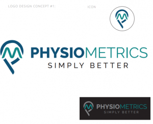
- Logo concept #1 The colour palette was pre-determined by the client. The concept is a map pin that formed into a tilt letter ‘P’. The idea is for it to appear like “the marker”. The font selected (Sans serif) has been used to show firmness and assurance much like the brand itself.

-
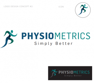
- Logo concept #2 The colour palette was pre-determined by the client. The concept represents health, activity and flexibility. Our choice of font (Sans serif) has been used to represent firmness and assurance.

-
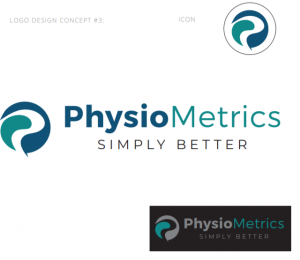
- The two shapes used in the concept form into a ‘P’. The two shapes represent the combination of “Physio” and “Metrics.” Sans serif fonts used to show firmness and assurance.

