

JKL wanted a text only logo, one that paid tribute to their childhood heroes QFM. The team at JKL wanted something that was easy to decipher, yet a visual representation that left their potential and existing customers feel amazed.
They had a preference for a luxurious gold logo.
The process
Like all our logo consultations, we start by giving our clients a logo brief questionnaire to fill out. Based on the answers in the questionnaire, we design three logos/logo concepts for the company to choose from.
-
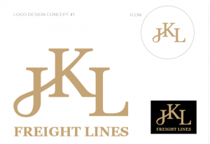
- CONCEPT #1 A wordmark logo, the one has been created as a word mark logo. The icon represents the core services of JKL and the multiple ways that they can connect, transport, move freight. This logo is a tribute to this company’s childhood heroes: QFM. The font used (serif fonts) was chosen to add a bit of style to the logo.

-
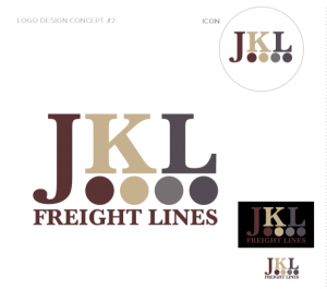
- Concept #2 This concept was designed based on items packed in together for transport or storage. Not only symbolic but the circular dots can also simply be recognised as the wheels on a large truck. An extra blue-grey colour was introduced in the colour palette as a stabilising colour; portraying dependability and professionalism in all aspects of the company’s dealings. The shade of gold used in concept 2 is slightly lighter than the one used in concept 1.

-
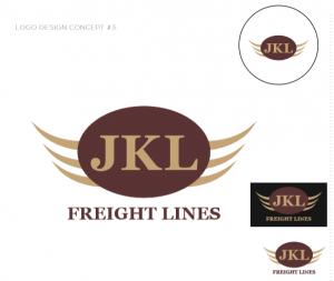
- Concept #3 A different approach, concept 3 is designed to be an all-in-one logo. With letters inside the icon always being used together. The concept was the front end of a large truck with a JKL insignia on the badge. The concept could also be interpreted as JKL ‘moving quickly’ with the swooshes being movement lines.

