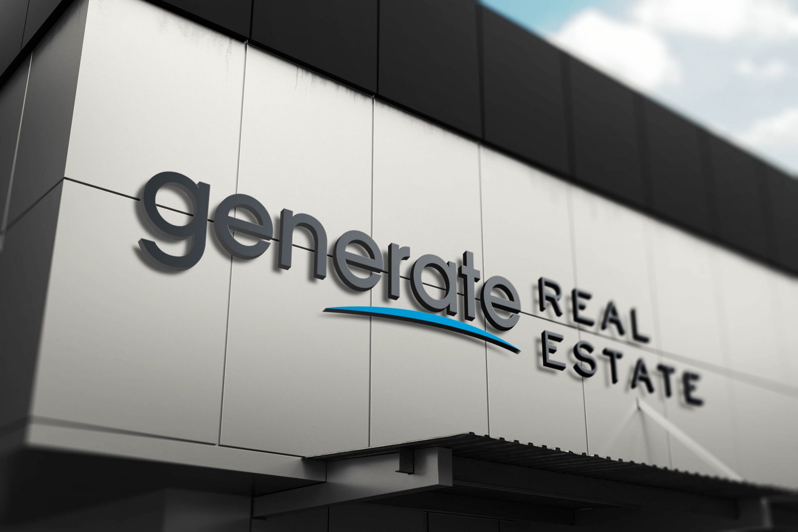
Generate Real Estate Brand

The Brief
Generate Real Estate wanted an entirely new brand to portray: a stylish brand, trust and superior service. their target market were upper middle class families, your average suburban Mum & Dad, preferably with properties in the $500k - $900k range. The number one thing that separates GRE from their competitors is they actually care about the outcome for their clients. They focus on whether it’s in the client’s best interests to list their property, or whether it might be better for them to rent the property out. They liked mono weight geometric fonts and the colours they wanted to use were blue black and white.

Our Approach
Our approach was nearly entirely based on a typographical concept for this brand. We chose a mono weight geometric font but added in the blue swoosh to bring an element of style and passion to represent the clients approach to selling real estate. The font choice was very important to get right in the logo as it needed to be very clear and legible at very small sizes and on busy backgrounds like real estate websites. The colour blue was chosen to represent communication, trust and success. We explored lots of black and white and blue but ended up using a grey instead of black, for a softer, friendlier and modern palette. The shade of grey has a blue in it to tie the colour scheme together.

Results
A stylish brand that encourages trust and shows the clients' passion for communication and success.
