Soundality

The Brief
Looking for something minimal, clear and direct, yet something that made her stand out among her competitors.
Part of the education industry, Soundality needed something that fully represented their years of expertise, knowledge in the field, and immaculate professionalism.
However, at the same time, Alison (Owner Soundality) wanted something professional, yet subtle with a touch of femininity.

Our Approach
We wanted a logo that did not only look good but was also conceptually relevant, hence, we brainstormed and looked into educational concepts and theories.
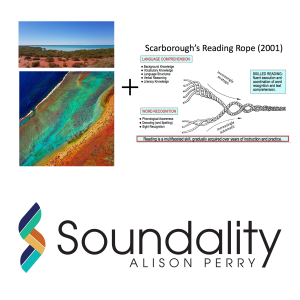
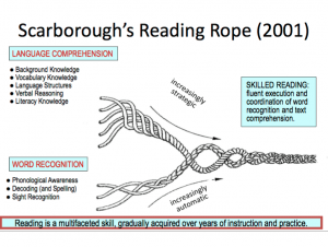
When we came across Scarborough's Reading Rope theory, we knew this was the one! We designed the logo around the Reading Rope theory, thus symbolising the multi-faceted approach learning is; how a teacher teaches kids to read and write.
The second part was deciding on a colour palette that gave off a calm, subtle and feminine vibe.

The Result
A geometric S with many layers/strands woven together based around Reading Rope theory, that too combined with the gorgeous colour palette resulted in a logo that was in harmony with the core services of Soundality.


